Bonfire Studio Portfolio
Website for a Construction Company Beta Launch
The Background
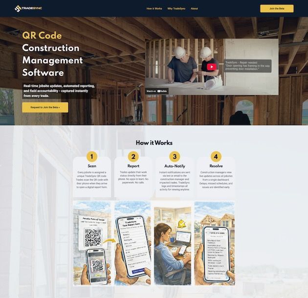
TradeSync is construction management software designed to give builders clear visibility into what’s happening on their jobsites.
They use QR codes placed at a building site to document progress, track trade activity, and create a reliable record of what’s happening in the field.
Before launching publicly, the TradeSync team partnered with our sister company Big Fish to develop their SaaS platform.
As the platform approached its beta release, they needed a website that could clearly explain the product and invite builders join the beta.
At that point, the company didn’t yet have a web presence — just an early draft of messaging and a product that needed to be introduced to the market.
The Goal
We determined that TradeSync didn’t need a large marketing website yet.
The founder was preparing to introduce the platform directly to home builders through conversations, meetings, and existing industry relationships. What they needed most was a clear, credible website they could confidently send people to.
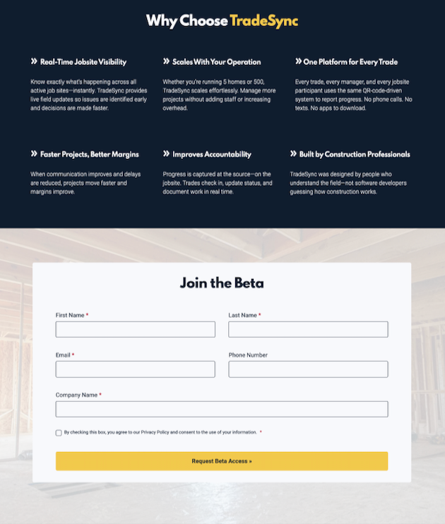
That meant creating a focused web presence that could quickly explain what the platform is, why it matters to builders, and give interested companies a simple way to join the beta.
The challenge was making a new product feel understandable and legitimate without overwhelming visitors with too much explanation.
Our Approach
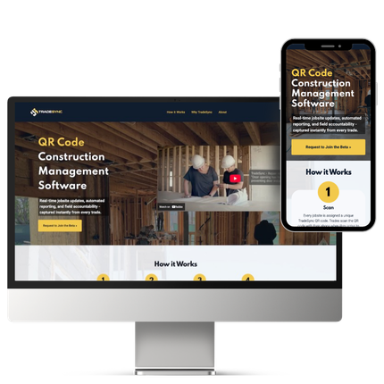
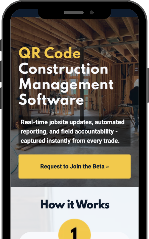
Because the product was still early and the goal was very specific, we recommended building a single-page website rather than a traditional multi-page structure.
This allowed the entire story to unfold in one clear, scrollable narrative — from introduction, to product explanation, to the beta sign-up.
Rather than overbuilding too early, we focused on giving TradeSync exactly what they needed for this phase: a polished, credible destination to support outreach, conversations, and early traction.
We worked with the TradeSync team to refine the existing messaging and organize it into a structure that builders could quickly understand.
We also refined the visual presentation of the brand during the project, simplifying the logo’s color palette to create a more modern presence across the site.
The result is a focused landing page that explains the platform and leads visitors naturally toward the primary action: joining the beta.
Collaboration
To help visitors understand the platform quickly, we introduced TradeSync to a local-to-them video production team in Tampa to create a short product explainer to use on the website.
Video makes it much easier to communicate the concept behind TradeSync and provides immediate context for builders.
Built to scale on Duda
We built the entire site on Duda, giving TradeSync a flexible foundation to expand on.
For an early-stage product, Duda enables them to move quickly with a polished website today while still having room to expand later with additional pages, product content, or a blog as they grow.
This website is a great example of the kind of Duda web design work we do for businesses that need something practical now, and scalable over time.
The finished website gives TradeSync a clear and credible public presence as they begin introducing the platform to builders.
Instead of a large marketing website, the single-page structure focuses entirely on helping visitors understand the product and encouraging interested home builders to join the beta.
As the platform grows and the product evolves, their website provides a strong foundation that can expand alongside the business.